
Landing pages for comparison ads: what the page has to show
Hookpair team. Updated
Compares the product with an alternative, such as the usual way of doing something. Visitors arrive expecting the comparison continued in detail, fairly.
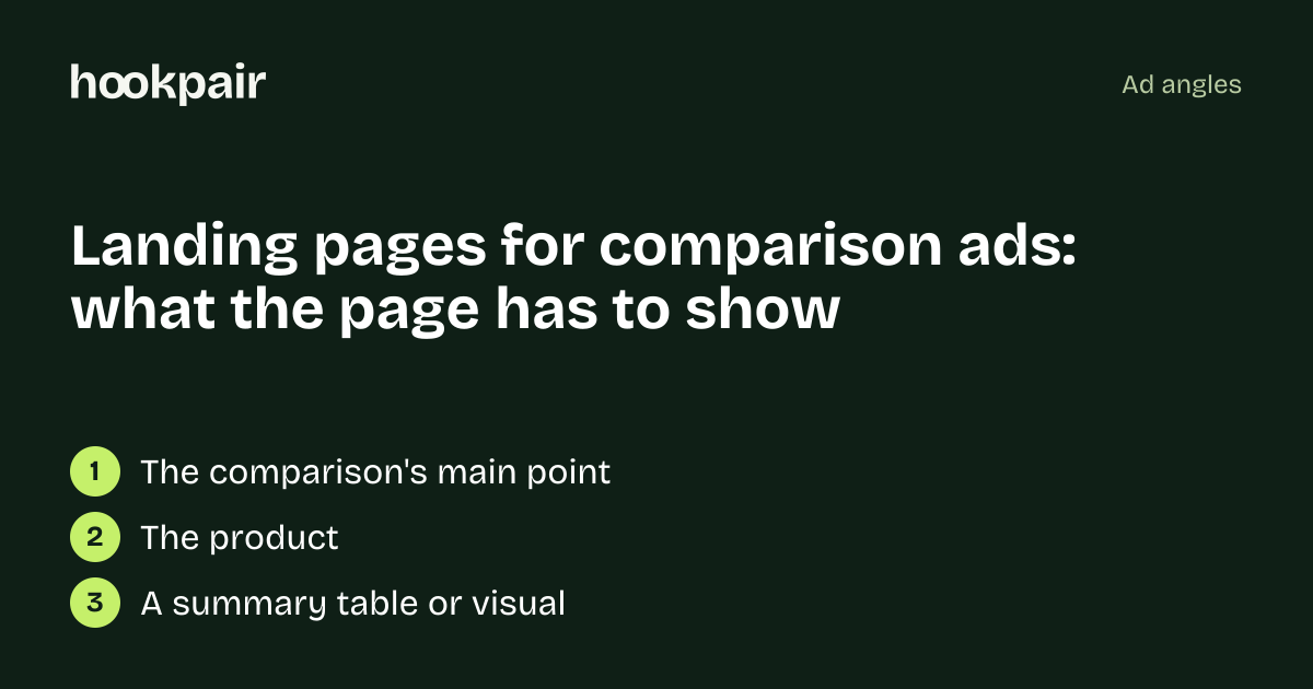
The first screen
- 1The comparison's main point
- 2The product
- 3A summary table or visual
Proof that continues the ad
- Specific, verifiable differences
- Reviews from people who switched
- Sources for any numbers
Mistakes that break the match
- Unfair or unverifiable comparisons with named competitors (regulated in the EU and US)
- A page that drops the comparison
Which page to send them to
A comparison landing page or a product page with a comparison section near the top.
Check yours with a free audit.
Free tool: Hook checker · Five checks for an ad's first line: cut off in the feed, concrete detail, who it talks to, empty superlatives, claims that need proof.
Questions
What do visitors from comparison ads expect?
The comparison continued in detail, fairly.
What's the biggest mistake on pages for comparison ads?
Unfair or unverifiable comparisons with named competitors (regulated in the EU and US)